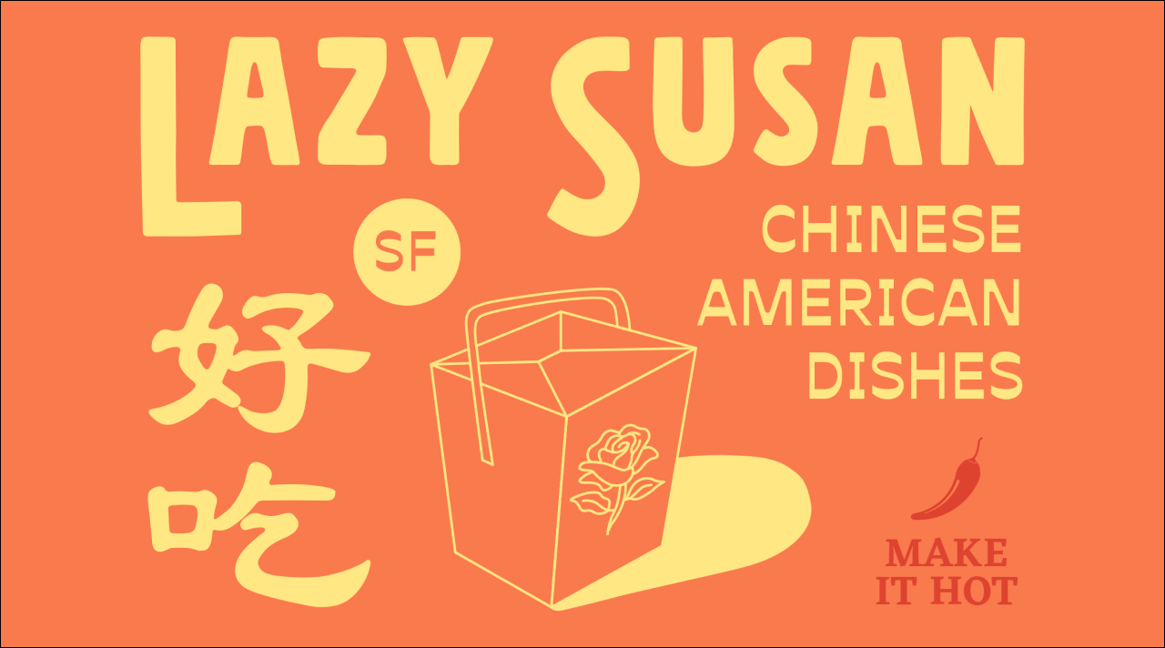
Lazy Susan
Iconic Chinese fare.
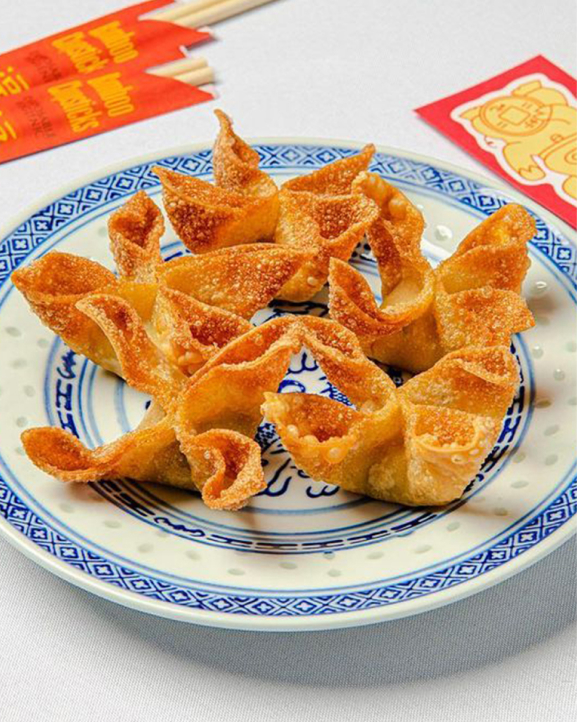
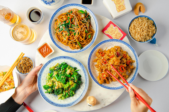
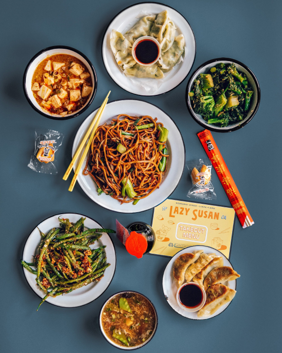
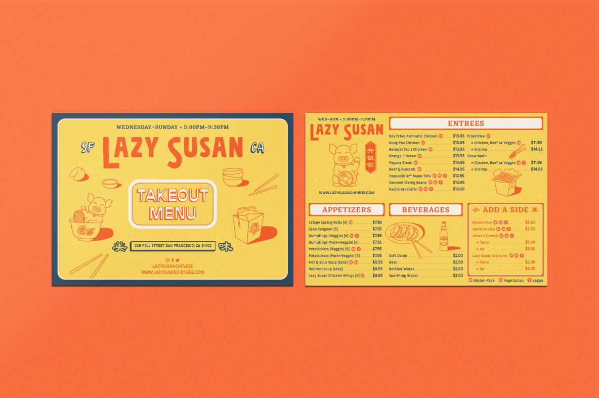
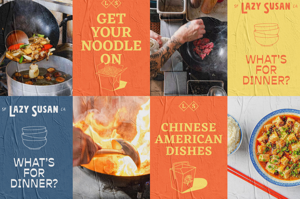
Lazy Susan is a San Francisco-based Chinese restaurant that embraces the confluence of American and Chinese cuisine. The name cheekily invokes the shared dining experience associated with Chinese food, nodding to the restaurant’s takeout-only menu featuring classic dishes with a modern twist.
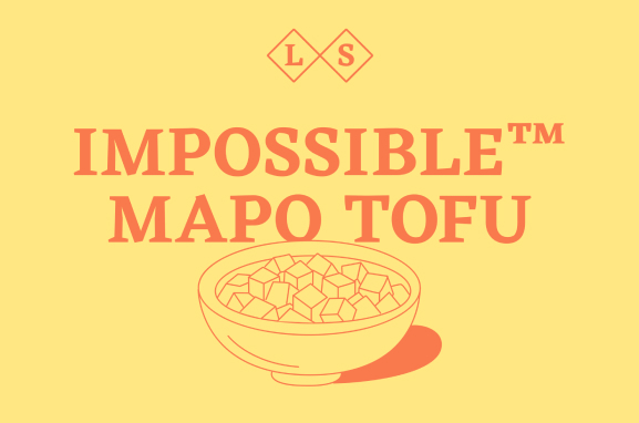
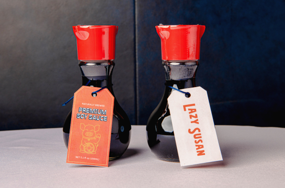
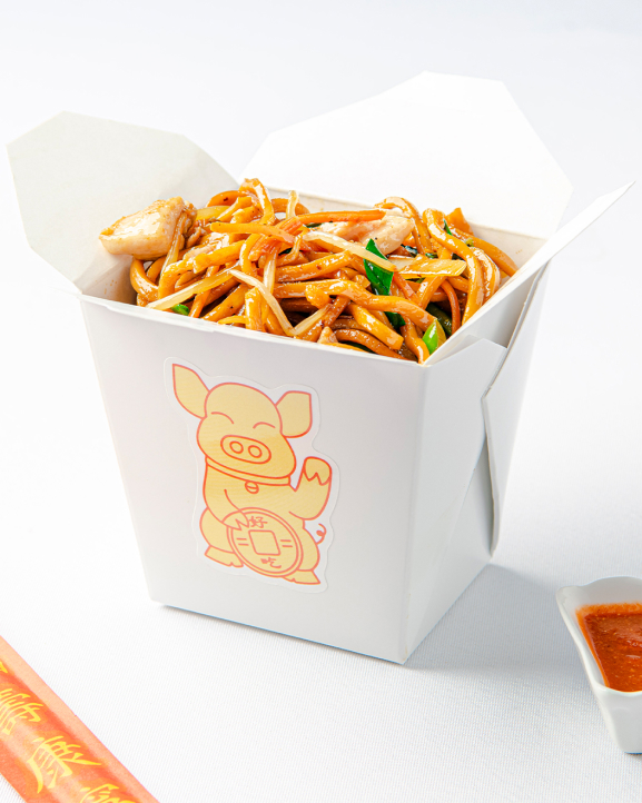
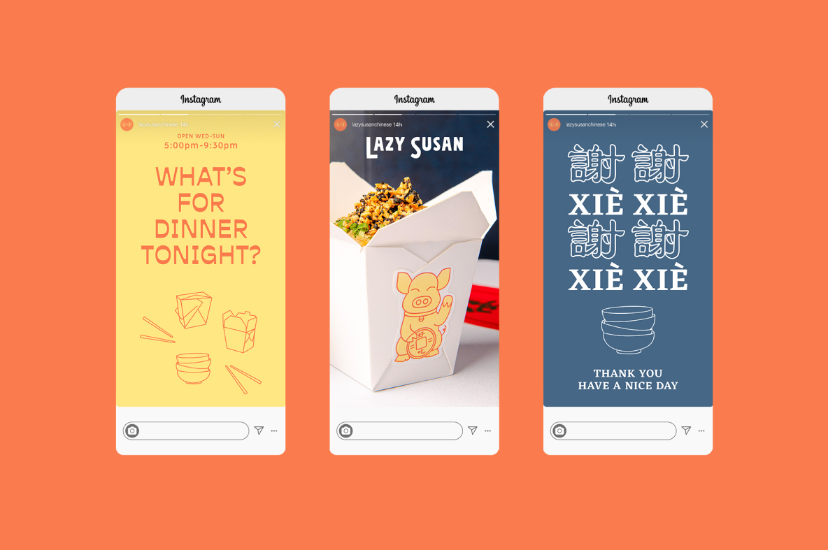
We thoughtfully crafted a brand identity for Lazy Susan that captures the coalescence of both culture’s cuisines. Starting with a brand mascot, we reimagined the famous “beckoning cat” motif as a charming pig, symbolizing good fortune. Alongside our bold, organic logotype lives a blend of mandarin calligraphy and traditional serif type, creating a harmonious typographic ecosystem with eclectic flare. This innovative approach to branding highlights the restaurant's dedication to honoring tradition while embracing contemporary aesthetics.
Lazy Susan refreshes the Chinese-American dining experience for a new generation of patrons.
What we did
- Brand Strategy & Positioning
- Naming
- Brand Identity
- Verbal Identity & Voice
- Packaging & Merchandise Design
- Environmental & Signage Design
- Digital & Web Experience